Tiny homes are, as the name suggests, tiny.
As such, everything needs to be done with the limited space in mind — including the painting.
Painting doesn’t really add or take up any space, but the colors you choose can dramatically influence how much space you feel you have.
You might be able to get away with looser color choices in larger spaces, but in tiny homes, where space is at a premium, you certainly don’t want your paint job to make your already small space feel even smaller.
Here’s how to choose the right paint colors.
Color Psychology: How Paint Colors Affect Mood and Perception of Space
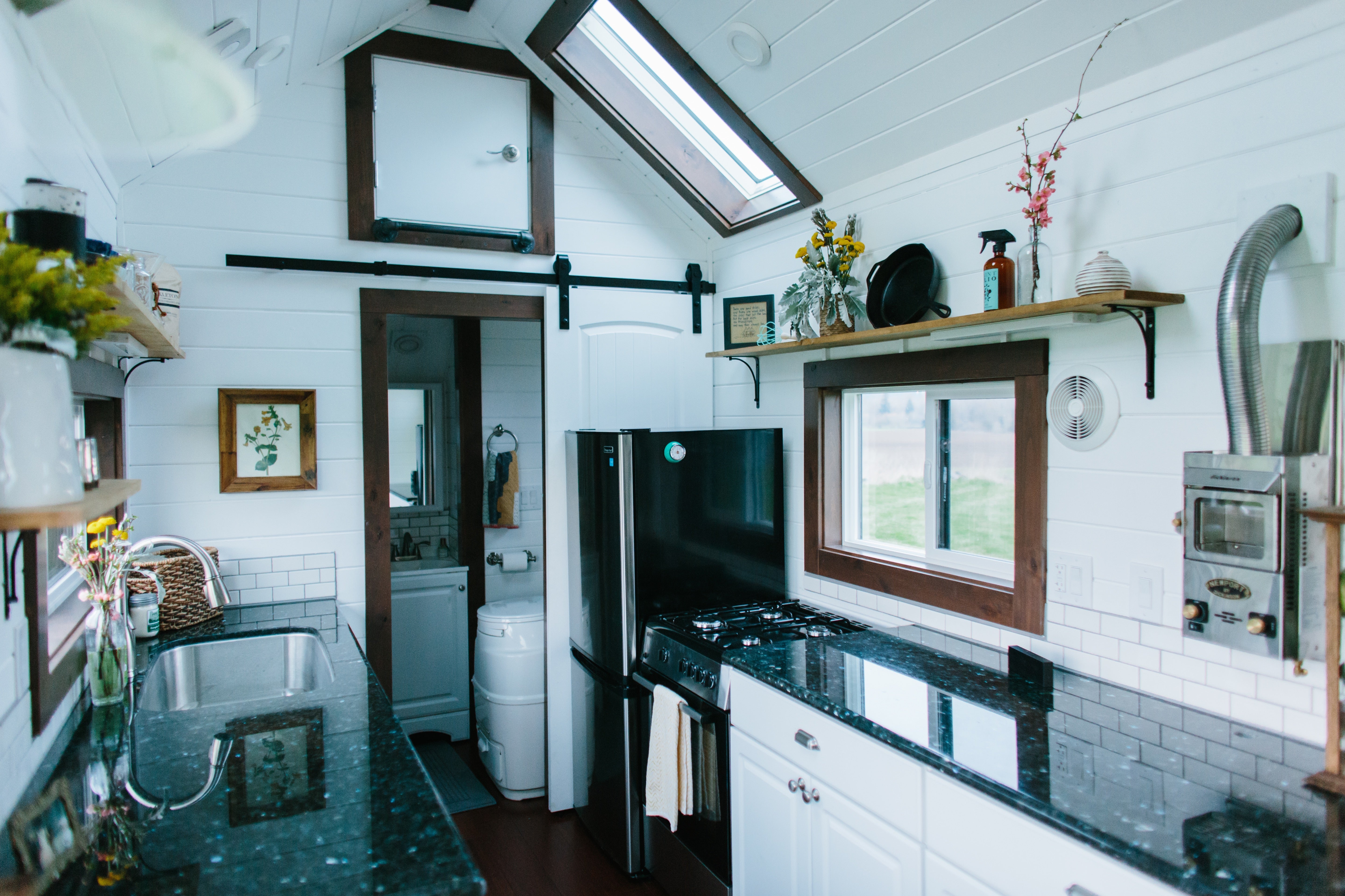
The bathroom is typically the smallest room in any home. Ever noticed how most of them are painted white?
Yes, white does make a space look more modern and luxurious, but that’s not the only reason.
White is actually one of the best colors for tight spaces, because of their ability to reflect light.
A color’s ability to reflect light is measured using the Light Reflectance Value (LRV), a range from 0 (absolute black) to 100 (pure white).
The closer a color is to white, the higher its LRV, and the better its ability to reflect light.
Why does this matter?
Because the amount of light reflected directly affects how easy it is for you to see everything in the room. It doesn’t make the room bigger of course, but it does make it not seem smaller.
If you use dark colors instead, they bounce less light around and reduce visibility, which makes it harder to see everything in the room, particularly the walls and the edges. This makes the room feel smaller than it already is, because when you see less, your brain processes it as less space.
This is made worse by the fact that most tiny homes don’t get much natural light. Since tiny houses already don’t have much wall space, adding too many windows or making windows too large will result in the windows taking up too big of a portion of the walls. It could also compromise structural integrity.
Consequently, tiny houses tend to have only a few windows or skylights.
Natural lighting is instrumental to making a space feel open and airy, so you need to maximize the limited natural light you get by using lighter colors that bounce light around better.
With that said, here are the best colors to use for your tiny home’s interior.
1. Off-Whites and Whites
White, as we just explained, reflects the most light, so if you want your space to feel as large as possible, there’s no better option than white.
Off-whites are very close in terms of light-reflecting ability to white, so they’ll do a similarly great job of making your space feel bigger. At the same time, they also add a little warmth to your space, as compared to pure white, which can be a bit too minimalistic.

Some examples of good off-whites to use include:
-
Eggshell
-
Ivory
-
Alabaster
Whether it’s white or off-whites, they open up your space while enhancing mental focus and clarity.
2. Soft Neutrals
Next on the list is soft neutrals (excluding black of course).
White and other shades of white may be the best at making your space feel larger, but they’re not your only choices.
As long as you’re sticking to bright colors, your space will do just fine, even if they’re not white or other tones of white.
Some great soft neutrals to consider for your tiny house are:
-
Greige (a blend of gray and beige)
-
Light taupe
-
Pale sand
Each of these colors brings more warmth to your space than white, while still doing its part to enhance openness and spaciousness.

The colors we listed are earth tones, so they’ll also give your space a more grounded, cozy, and balanced vibe.
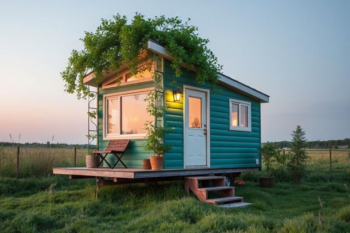
3. Light Blues and Greens
If you’re looking to add more personality to your space, light blues and greens are prime candidates.
Light blues invoke feelings of calm and relaxation, while light greens bring nature into your home.
You could use them for your living room, but it can feel a bit too much after a while, and you’re better off using the colors above to open up your space.
Instead of your living room, light blues and greens are best used for bedrooms, because of the specific feelings of calm and relaxation that they invoke.
Here are some specific shades to use:
-
Pastel blue
-
Seafoam
-
Sage green
4. Cool Gray
Gray itself is a dark color, but light, cool gray makes your space feel more sophisticated and elegant without making it feel constricted or cramped.

With cool gray, you’re getting a modern, soothing, refined vibe. Given that it’s a slightly darker color, it definitely won’t open up your space as well as the brighter colors above.
However, it creates a cozy, calming atmosphere that works beautifully in small spaces.
Final Tips
Before we wrap up, here are a couple more tips.
Firstly, if you don’t have the confidence to undertake the interior painting project, enlist the services of professional house painters.
House painting requires various techniques that take practice to get right, and it’s a tedious process. If you’re not confident of doing a good job, you can hire a house painter to free up your time and energy and get better results.
Next, choose low-VOC paint options, or zero-VOC ones if possible.
Interior paints are already made to be low-VOC, and those are fine for normal-sized houses where there’s usually more space.
For tiny houses, low-VOC paint options can suffice, but even then, due to how limited space usually is, the VOCs spread around the home quicker and can lead to your indoor air quality deteriorating.
Eventually, this could result in headaches, respiratory irritation, and long-term health effects.
So ideally, choose zero-VOC paints if possible. Make sure to be careful when choosing, as many homeowners confuse low-VOC and zero-VOC paints.
Zero-VOC paints are going to cost more, but they’ll pay off in better health. As the saying goes, health is wealth.
Make sure to also ventilate well when you’re painting, even if you’re using zero-VOC formulas. These may not release VOCs, but they can still release odors and irritants, which will build up if you don’t ventilate the area, and can also cause headaches, dizziness, and irritate your eyes or throat.
Lastly, to add personality and character to your space, you can introduce strategic accent walls. Most of your home should still be painted in the colors we listed, but a single colored wall behind a bed or couch adds personality without ruining the overall aesthetics.
This accent wall should complement your aesthetics, so it shouldn’t be something bold or dark. Instead, muted colors like dusty blue and eucalyptus pair perfectly with the soft colors that we recommended.
With that, have fun painting your tiny home interior!
Share: